For most of this project the inventory was honest but plain. Every sword, potion and scrap of hide was a white silhouette on a black square, tinted gold by the interface and dropped into a slot. It worked. You could tell a blade from a bottle. But a screen full of tinted silhouettes reads as one flat tone no matter how carefully the panels around it are built, because the objects carry no material — no brass, no worn leather, no light caught on a faceted stone.
This is the story of replacing all of it. Two hundred and four painted icons later, a few things turned out to matter far more than we expected, and almost none of them were about drawing.
Finding the style before drawing anything
The first attempt went badly, and it went badly in an instructive way. We described the look we wanted in words — dark fantasy, ornate, painterly — and got back a set of museum-accurate medieval arms. Correct as history. Completely wrong as loot. So we pushed the other way, asked for enchantment and runes and gemwork, and got sixteen weapons that all looked like relics pulled from the final vault of a dungeon. When every item looks legendary, nothing does.
Three rewrites in, the problem was obvious: we were guessing at a target we could not describe. So instead of describing it again, we asked for one sword rendered sixteen different ways — oil paint, cel shading, pixel art, woodcut, low-poly, glossy mobile-game icon, and so on — and picked a cell.
The cell we picked was the plainest one on the sheet: semi-realistic digital painting, matte and muted.
What made that choice easy to trust was a second, independent check. The game already generates art — character portraits and scene backgrounds — and those generators have their own instructions written months ago. Read them back and they say painterly realistic fantasy, muted and atmospheric colour palette, no oversaturated colours. The avatars are oil-painted portraits in warm candlelight; the scenes are grey-green fog and lantern glow. Two separate methods, arrived at from opposite directions, landed on the same answer. That is about as much confidence as a taste decision ever gets.
The glossy mobile-game style, incidentally, was the one that looked best in isolation. It also would have sat beside a muted painted portrait like a sticker on an oil painting. Coherence beat individual appeal.
The only test that matters is 22 pixels
An icon in the inventory grid renders at twenty-two pixels across. Twenty-six in an equipment slot. That is the whole canvas.
Every sheet that came back looked wonderful at full size, so we started scaling them down to twenty-two pixels and looking at them there instead. The first time we did it, ten of sixteen weapons read instantly — axe, mace, crossed daggers, bow, crossbow, shield, tome, orb, warhammer, cleaver.
The other six were the same picture: a thin brown diagonal stick. Sword, spear, staff, wand, scimitar and knife had collapsed into one shape. Staff and wand were pixel-for-pixel indistinguishable, which is unhelpful when they are different weapon types.
The fix was not more detail. Detail is the first thing to die when you scale something down by a factor of twelve. The fix was to force the shapes apart along the only axes that survive: length, width, curvature and orientation. The sword got a much broader blade and a wide crossguard. The staff became the tallest object on the sheet, strictly vertical, with a distinctive forked head. The wand became the shortest and stubbiest, drawn horizontally. The spear got a head a third of its total length on a short shaft. The scimitar got a dramatic crescent instead of a polite bend.
After that, all sixteen were identifiable from their black silhouettes alone — which is the real test, because at icon size that is roughly all you have.
Rarity has to survive the same shrink
Items come in five rarities, from common to legendary, and we wanted the art to say so rather than leaning entirely on a coloured border.
The approach that worked was a grid: one row per item type, one column per rarity. Generated that way, the model has to make each step visibly better than the one to its left, and it can see the whole progression while it does. Generated as separate sheets, it cannot — which is exactly how we ended up with a handsome plain tier and a soulbound tier with nothing in between.
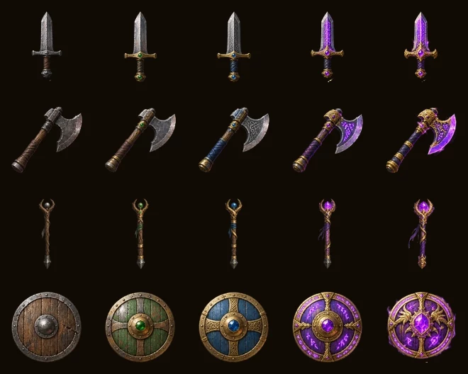
Common through legendary. Plain iron, then a brass collar and a dull green stone, then etched steel and a cut blue stone, then rune-work and a violet gem, then gold hardware and enchantment light.
Then we shrank it to twenty-two pixels and learned something useful: at that size, only the glowing tiers are distinguishable. The green stone on an uncommon item and the blue stone on a rare one are one or two pixels and simply vanish. Our first instinct was to collapse five tiers into three.
That instinct was wrong, and the reason is worth remembering. The same file also renders at fifty-two to sixty-four pixels in the item detail panel and the hover tooltip — and there the stones, the etching and the brass collars read perfectly. In the grid, rarity is carried by the border colour anyway. So the art does not need to duplicate that job at twenty-two pixels; it needs to reward you for looking closer. All five tiers stayed.
One rule held throughout: the silhouette does not change between tiers. A legendary sword is the same shape as a common one. Shape says what it is; gold and glow say how good it is. Trading that away to make legendaries exciting would have undone all the silhouette work above.
Named sets
Beyond rarity, some gear belongs to a matched set — and a set should be recognisable across the whole inventory at a glance. That means the theme carries the colour, and it replaces the ordinary enchantment glow rather than adding to it. A legendary Flamebringer sword glows orange, not orange and violet.
Flamebringer
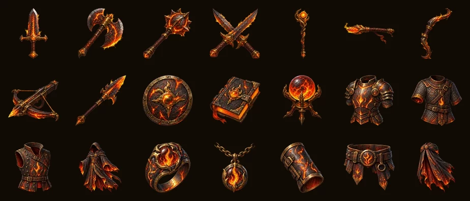
Blackened steel with molten cracks running through it, soot-darkened brass, and flame motifs worked into the ornament. Twenty-one pieces, from the sword down to the belt.
Frostgiant
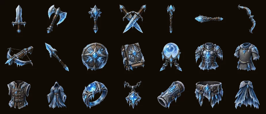
Frosted pale steel with a blue-white sheen, rime crusting the edges, and shards of glacier ice set into the metal. The same twenty-one slots, unmistakably a different set.
Both survive the shrink better than rarity does, which makes sense in hindsight: a whole-object colour shift reads at twenty-two pixels where a small gem does not. Set art also falls back gracefully — if a particular piece has not been drawn for a set, the item quietly uses its ordinary rarity icon instead. That is what makes sets affordable. A set with a distinctive sword and breastplate but ordinary boots needs two pieces of art, not twenty-one.
What the interface got out of it
The same pass produced the brass hardware the panels now wear. The game is called World Stories and the app icon has always been a gemmed tome, so the panel corners are the book's corner fittings and the mark above the login card is the book itself — not the generic star that sat there before.
There is a lesson buried in that one too. The first attempt at the ornament sheet came back as a jewelled rosette, because the instruction asked for the gem set into the book's spine rather than the book. It is a book. It should look like a book.
Numbers, for the curious
Two hundred and four item icons: twenty-four types across five rarity tiers, two full named sets, plus consumables and materials. Around 1.4 MB for the lot, because a cut-out icon at ninety-six pixels compresses to a handful of kilobytes.
And one number that says more than the rest: the style paragraph driving all of it was rewritten four times before it was frozen. Each rewrite fixed the previous fault and introduced a fresh one — too dark, then too retro, then too flat. It stopped changing only once we started choosing from rendered options and measuring the results at the size players actually see, instead of arguing about adjectives.